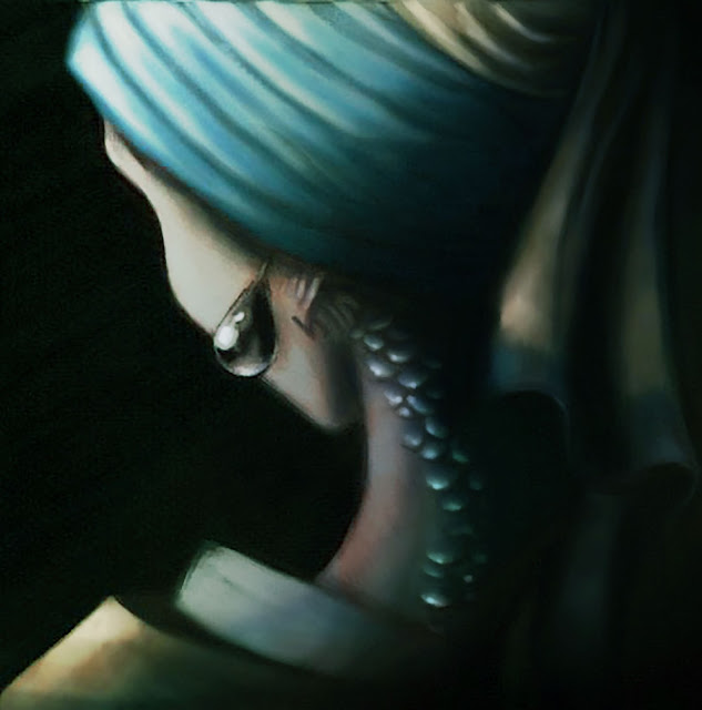
Illustration 2
For the final illustration, I chose to revise an old concept art piece of mine to test the techniques we've learned in Photoshop this semester. The picture shows Vermeer's Girl with a Pearl Earring from a different angle, and shows that her head wrap is hiding scales and gills. The old version of this picture was flat and did not have enough value range in some places, particularly where the focal point should have been- the scales. Using adjustment layers, including multiply and overlay to increase the values of the shadows, color dodge on the highlighted scales to give them more "sparkle", and hue adjustments, I was able to give the overall piece a stronger feel by making the colors look slightly underwater, and upping the light/dark value contrast in the focal point. I also used "Find Edges" on a duplicate layer on a low opacity to give it a sketchier look, as if she was painted on canvas.
Below are the old and revised versions. The revised version is at the top, the older version is at the bottom.


Below are the old and revised versions. The revised version is at the top, the older version is at the bottom.


Comments
Post a Comment